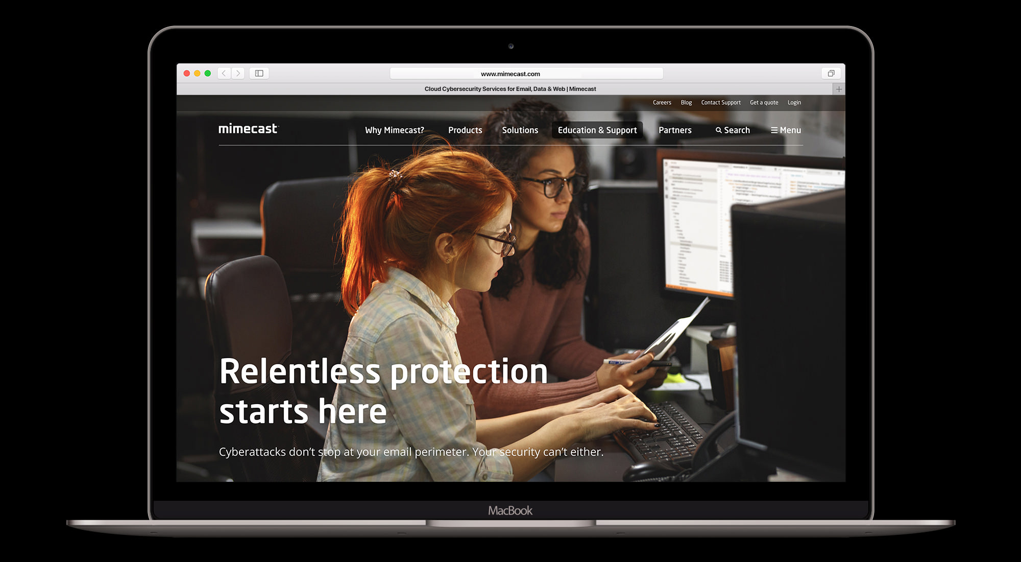
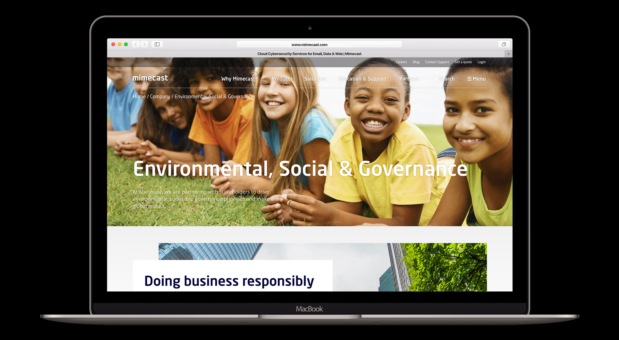
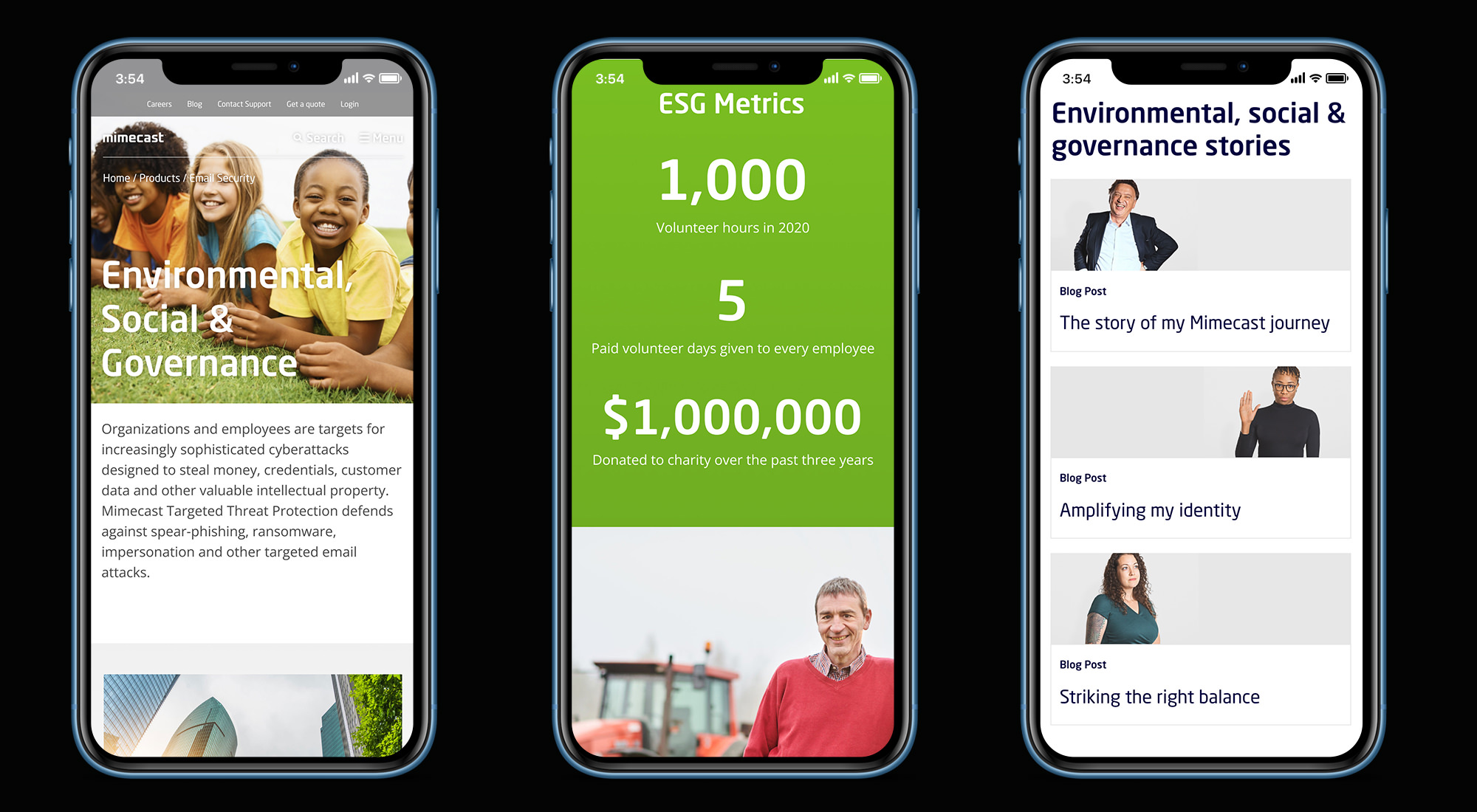
This is conceptual work loosely based around a proposed refresh of the public facing website.
You can also view this project in Figma.

Brief
During the pandemic, organisations across the world were noticing a subtle increase in eyeballs to their Environmental, Social and Governance (ESG) pages. Mimecast were no different and wanted to update their pages with a fresh new look.
Design
The initial plan was for the new pages to sit on its own subdomain and be controlled by a seperate content management system. This meant the design could break away from how the current public facing website looked. And give us the opportunity to present a more engaging and dynamic experience.
But I decided to expand the remit and see what we could do with an overhaul of the entire website.
Navigation
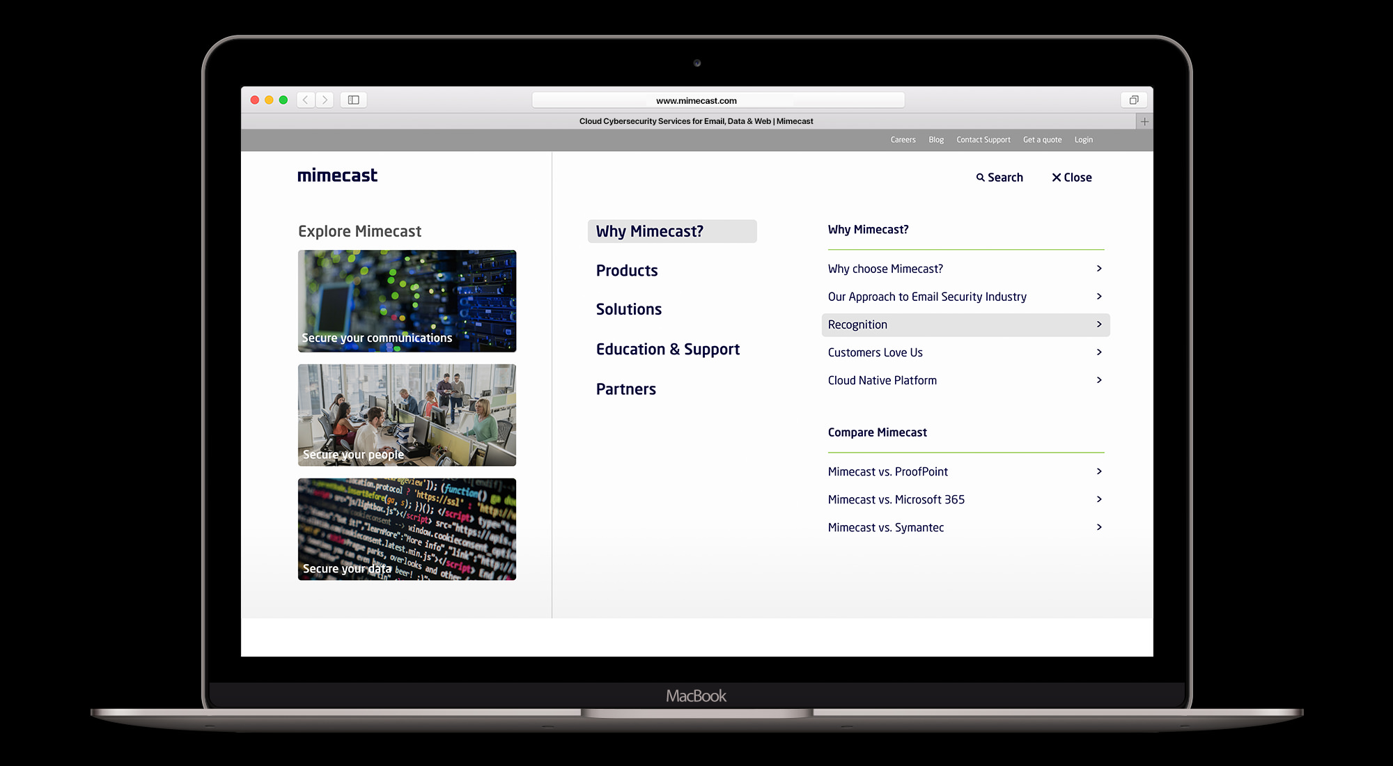
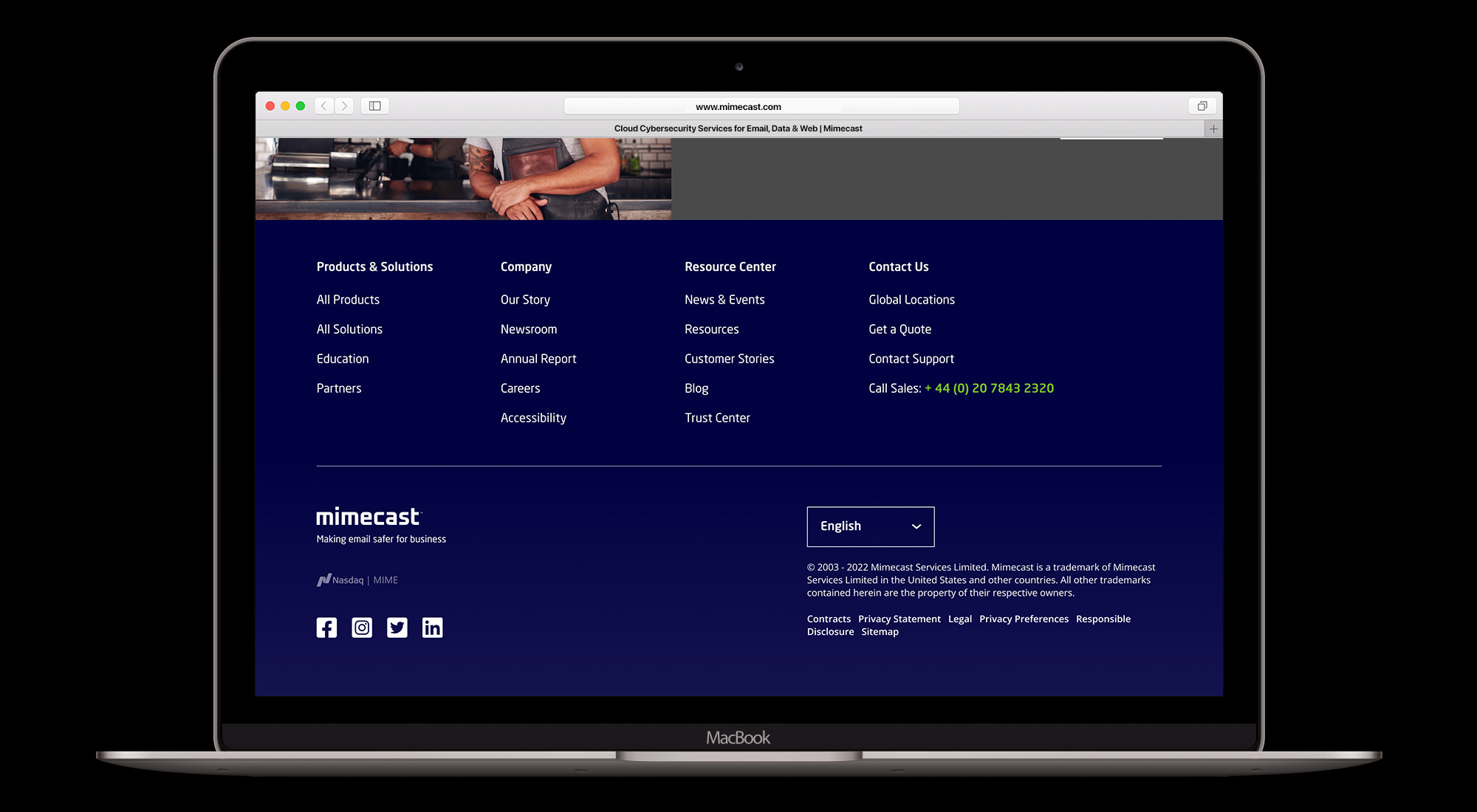
First thing to tackle was the primary navigation and footer. I felt the current implementation offered an inferior solution due to its limited functionality and use of the viewport. My design proposed a more effective use of screen real estate. Offering more options to get to key areas of the site as well as providing a more efficient method of accessing every section within.
Concept
The driving motivation behind the concept was to try to move away from a design that looked like it was dictated by a content management system. Which can often result in a very stiff, unengaging experience. Components are limited in terms of variance and sometimes you are forced to show information in a certain way because there are no other options available.
I thought about how the design would best serve the information architecture. Developing ideas on how to present text and images through the use of offset grids.
You can also view this project in Figma.
