Intro
Exclaimer provide a market-leading solution for centrally-managed professional email signatures.
One of the core features we offer allows customers to embed surveys within their email signatures. This can be used to calculate their NPS (Net Promoter Score) or CSAT (Customer SATisfaction) ratings. However due to survey fatigue and increasing lack of engagement, it can be very hard to understand how customer’s really feel.
You can also view this project in Figma.
Roles and responsibilities
I was the joint product design lead, there was also a project owner who headed up the AI / data team. And as part of the design team, I also worked with 3 other designers who all had UI and front-end development experience.
Defining the problem
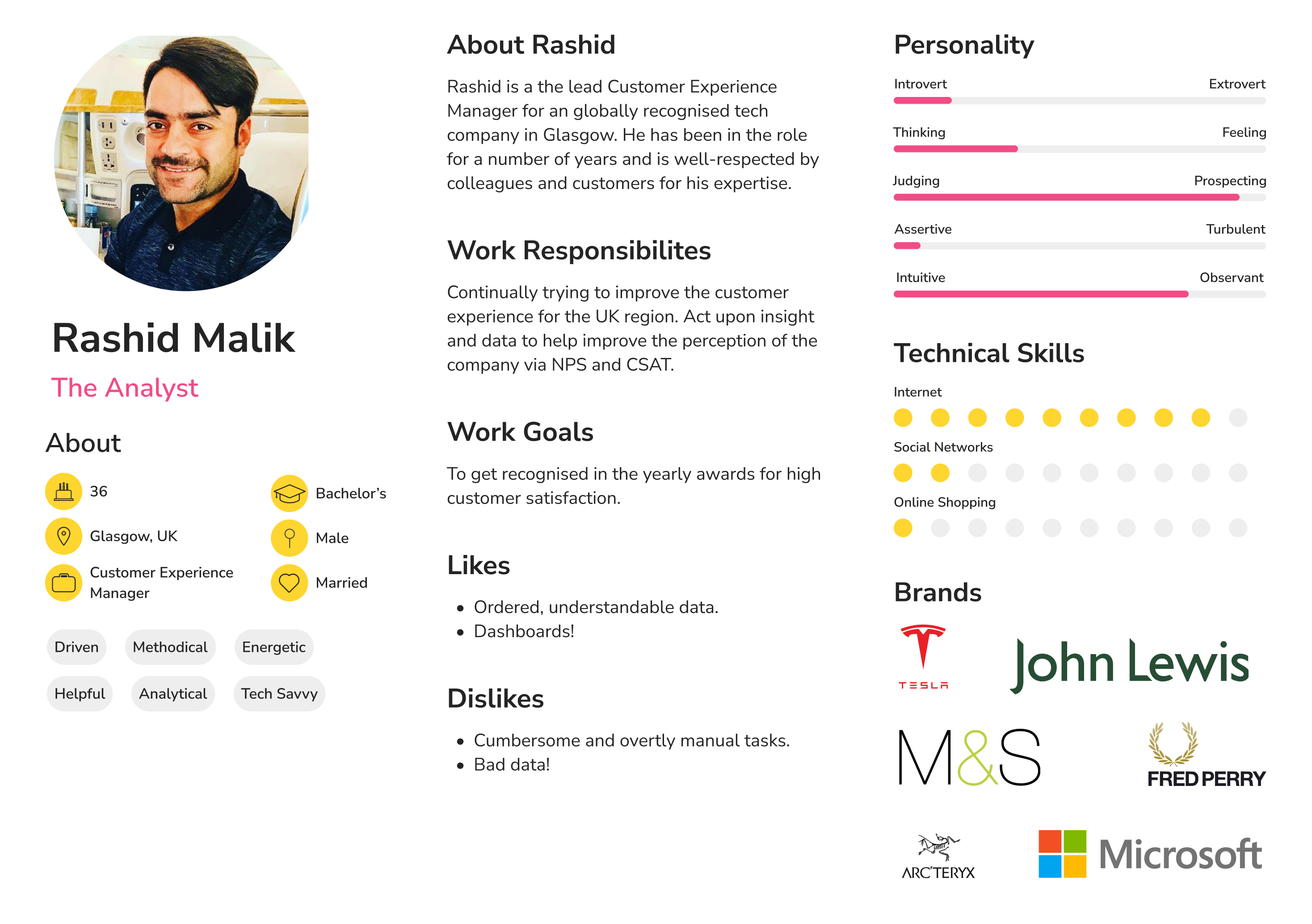
So the first step is to actually define the problem. So we selected one of our pre-defined personas and created a problem statement around it.
Rashid: A customer experience manager.
I'm trying to
Gauge the sentiment of our customers via surveys to see how and where we can improve the experience.
So that
We can respond to negative feedback, engage with customers better and ultimately improve our NPS / CSAT score.
But
We don’t hear from a large percentage of our audience. And if we do, there’s response bias due to only extremely angry or happy customers responding.
Because
Customers are bombarded with surveys and don’t always respond.
Which makes me feel
Worried that we are simply ignoring a significant amount of our customers.

Proposed solution
We’ve established that capturing customer sentiment via surveys is a manual and cumbersome process. So, we harness the power of Artificial Intelligence (AI) to analyse email conversations. Using Natural Language Processing (NLP) to predict sentiment in email – whether it is positive, negative or neutral. Keywords and phrases in email are assessed and scored on that basis. Having determined sentiment from all emails a ‘Predicted NPS’ metric can then be created and tracked over time – for an individual domain as well as in aggregate across all domains.
Quantitative UX Research
Exclaimer currently has a feature whereby customers can embed surveys into an email signature to gauge sentiment. After looking at top-level statistics, it looks like the click through rate (CTR) to these surveys varies from 2% to 8%. And these numbers dwindle over time for each customer, which perfectly demonstrates the concept of ‘survey fatigue’.
Qualitative UX Research
The objective here was to test the Predicted Feedback concept in order to gauge a general level of interest in this proposition, understand if there is a problem with existing NPS approaches and identify any primary reservations about the Predicted Feedback proposition. We used UserTesting’s global panel for this. The respondents were qualified by a profile that is relevant to Exclaimer as well as a screener question asking them if they’re familiar with NPS and customer satisfaction surveys – only those that said yes could participate.
From the 24 participants spread across the US, UK, Europe and Australia. We came to the following conclusions....
- Every respondent said the proposition was relevant to their company.
- The proposition was universally well-understood and resonated: people definitely faced common issues with how NPS is done today.
- It was also seen as providing an opportunity: upsell to happy customers, avoid churn of unhappiest, correlate general sentiment change in customers with business announcements or changes (price-rises, events, product updates).
- Beyond scepticism / intrigue on the AI accuracy and how it works there was a general positivity towards AI being useful, sentiment analysis being effective and AI helping make the difference in their businesses already.
- Overall: recognition of existing NPS approach not being perfect with very common problems felt widely, enthusiasm for the suggested solution and the additional opportunity it brings, need for data privacy green-light by internal teams and scepticism / intrigue on how the AI works / desire to see evidence of it performing.
UI / Prototyping
In essence, this is all about reporting and analytics - which means designing dashboards that display meaningful data. We decided to skip the wireframe stage and jump straight into prototpying through using an off-the-shelf UI dashboard kit within Figma.
After several rounds of designs, we settled on a dashboard with three views: Overview, Top 10 and Analysis.
Overview shows the top-line statistics that we think the user would want to see. This includes the all important Predicted NPS score along with a breakdown over time as well as how many emails were analysed. Everything can be filtered by date range and by domain.

Top 10 shows the highest detractors / promoters so you can easily identify your happiest / unhappiest customers.

Analysis digs deeper into the content of emails and shows samples. Each sample is assigned a key topic and each topic has a sentiment. This allows the user to then go back to their mail client and start to identify troublesome conversations where negative sentiment might exist.

Conclusion
Working with the AI team, a prototype was built and a select group of customers who had expressed were given access for free in return for ongoing feedback. We engaged with this group and made iterative changes to the dashboard to improve and refine the proposition. Unfortunately, the business felt it wasn’t core to their primary revenue stream and the project was put on hold.
You can also view this project in Figma.

